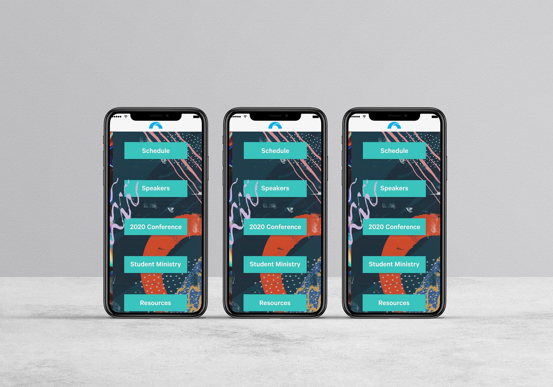
Student
Conference
CLIENT: The Hills Church
DATE: October 2019
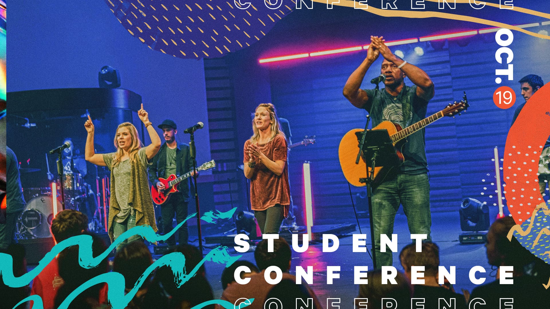
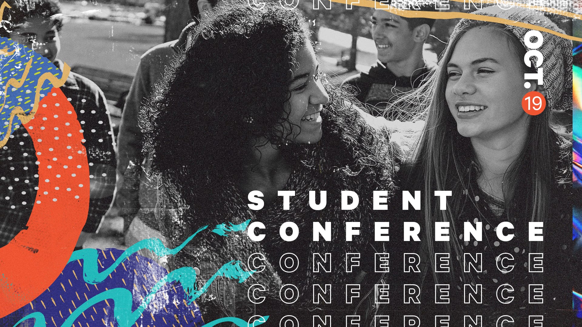
The Hills Church hosts yearly student conferences that reach over 900 parents and students. The conference brings students together to be part of something bigger than themselves.
In one full day, students from all over engage in powerful worship, hear inspiring messages from guest speakers, are challenged to discover a deeper purpose, and experience a sense of belonging. The Hills Student Conference seeks to equip a generation ready to impact the world around them.
Challenge
How to attract a younger generation and be relevant but also inspiring and motivating
Process
Solving complex problems in a creative and user-centric way
Design thinking 5 step process:
- Product Definition
The creative team sat down with Student Ministry leaders and had a kick-off meeting. The communications director, art director, web designer, graphic designer, and video director were all part of this meeting. We went over the purpose of the conference, target audience, team structure (who will design and develop the website, digital assets, video, promotional material, copywriting, and other assets), communication channels (how they will work together), and what stakeholders’ expectations are (how to measure the success of the conference). - Research
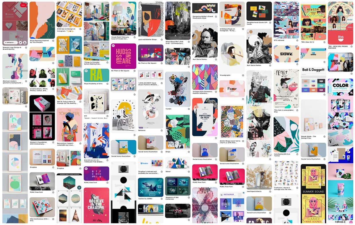
After doing some competitive analysis/research into other Student Conferences and having a few interviews amongst students in the ministry about their needs and wants for the conference, we created a brand mood board based on the conference goals and target audience. - Analysis
We created user personas to represent the different conference attendee types to help us better understand and connect to the user. - Prototype
The team sat down again and went over the wireframes sketches made by the art director to choose the ones that fit the goals. I then took the high fidelity mockups created by the art director and built prototypes and a library of UI elements that were used for visual and functional consistency in the designs. - Test
After a few iterations, I presented the final prototype to the team to test and review. I then presented the prototype to the Student Ministry leaders and a few students to test and review. Once the final prototype was approved, I made the page live on the website and checked the analytics for quantitative data on registration clicks and search queries.
Solution
Empower and inspire the youth through modern design
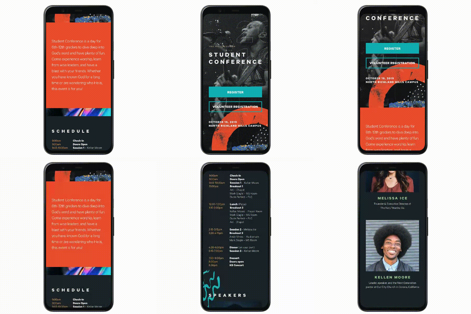
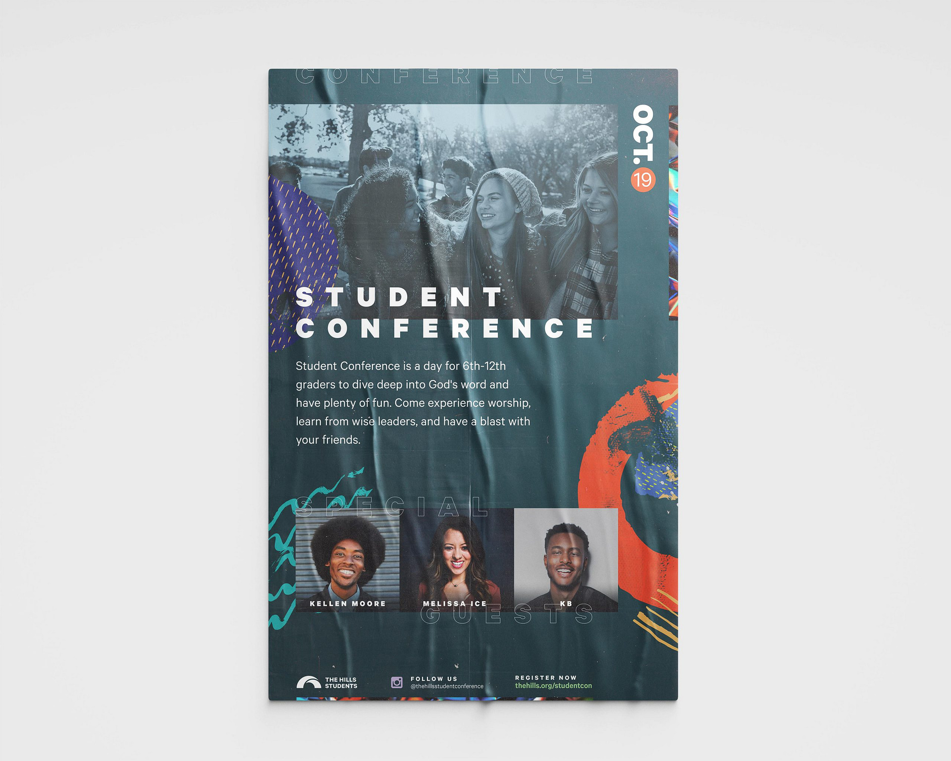
The goal for this webpage was to provide event information in a clean, concise manner while following The Hills Students brand guidelines. This resulted in a young, energetic, and modern design to attract our target audience.
Outcome
Empowering the next generation with knowledge and enthusiasm to change the world
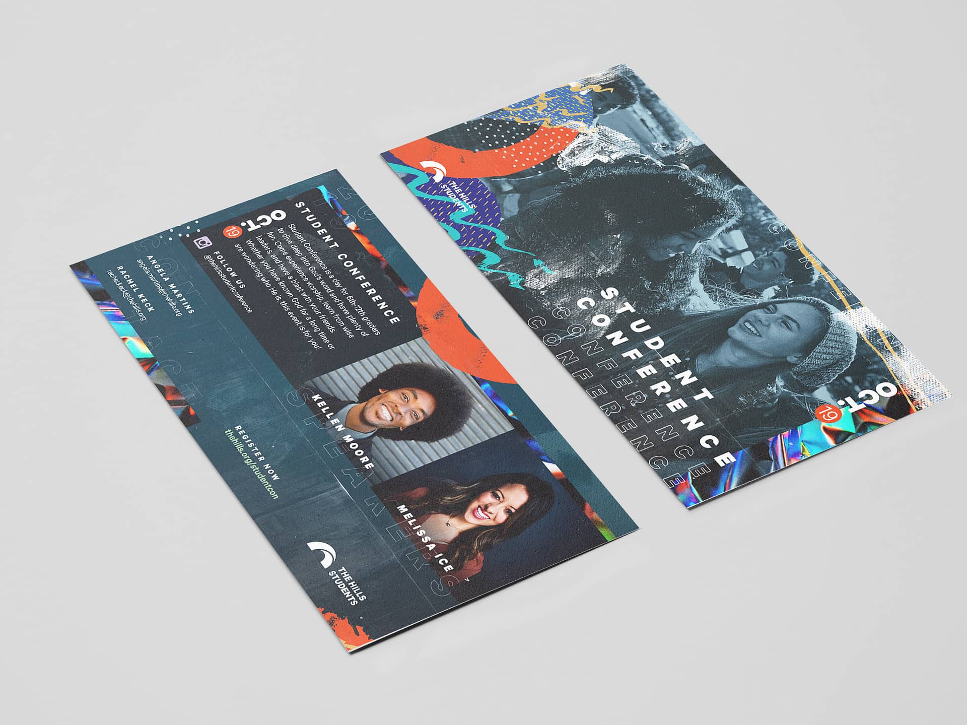
The goal was to host a memorable conference for students and to create great supporting elements to help the conference succeed. Registration numbers and merchandise sales exceeded prior years.

