Men's
Conference

CLIENT: The Hills Church
DATE: January 2020

The Hills Church hosts a multi-day conference exclusively for men every year. The goal is to bring men, ages 12 and up, together to share a meal, worship, and be inspired to be the ‘Man of God’ they were created to be. The conference starts with a ‘tailgate party’, followed by guest speakers that open up about their struggles, anxieties and vulnerabilities.

Challenge

HOW TO APPEAL TO MEN WITH DIFFERENT INTERESTS

The conference targets the ‘manly’ man by promoting grilling, archery events, football challenges, punch challenges and axe throwing. The focus is on high-energy entertainment, competitions, a massive amount of food, and an opportunity to be shaped into a ‘Man of God’. The event needs to appeal to men with other interests, and new promotional items were required to soften the event and appeal to more sensitive men.

Process

understanding user goals, frustrations, and end-task

Design thinking 5 step process:

  1. Product Definition
    The creative team sat down with the Men’s Ministry leader and had a kick-off meeting. The communications director, art director, web/graphic designer, and video director were all part of this meeting. We went over the purpose of the conference, target audience, team structure (who will design and develop the website, digital assets, video, promotional material, copywriting, and other assets), communication channels (how they will work together), and what stakeholders’ expectations are (how to measure the success of the conference).
  2. Research
    After doing some competitive analysis/research into other Men’s Conferences and having a few interviews amongst men’s ministry members about their needs and wants for the conference, I created a brand mood board based on the conference goals and target audience.
  3. Analysis
    I created user personas to represent the different conference attendee types to help me better understand and connect to the user. 
  4. Prototype
    In this stage, I sketched several wireframes to visualize the concept. The team sat down again and went over the wireframes to choose the ones that fit the goals. I then created high fidelity prototypes using adobe XD along with a library of UI elements that were used for visual and functional consistency in my designs.
  5. Test
    After a few iterations, I presented the final prototype to the team to test and review. I then presented the prototype to the Men’s Ministry leader and team members to test and review. Once the final prototype was approved, I made the page live on the website and checked the analytics for quantitative data on registration clicks and search queries.

Solution

SIMPLIFY AND SOFTEN

My goal was to rebrand the conference and design an attractive, user-friendly webpage that is consistent with the brand. The conference required brand guidelines that standardized their colors and imagery. I designed all digital and printed materials as well as merchandise, web page, and app for the event.

Outcome

DIVERSITY IS KEY
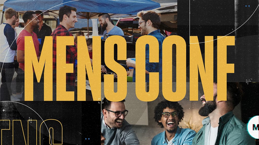
The Men’s Conference had a record turn-out, over two-thousand men attended the conference. The new promotional material, both physical and digital, was heavily circulated among the community. The use of a diverse group of men, along with the high impact colors was enough to increase attendance this year.