Livecareer
CLIENT: BOLD
DATE: 2022
BOLD has been helping people land a job since 2005. They have helped more than 30,000,000 people from all over the world discover their career path, build stronger resumes, interview with confidence, and boost their chances of finding the right job in less time.
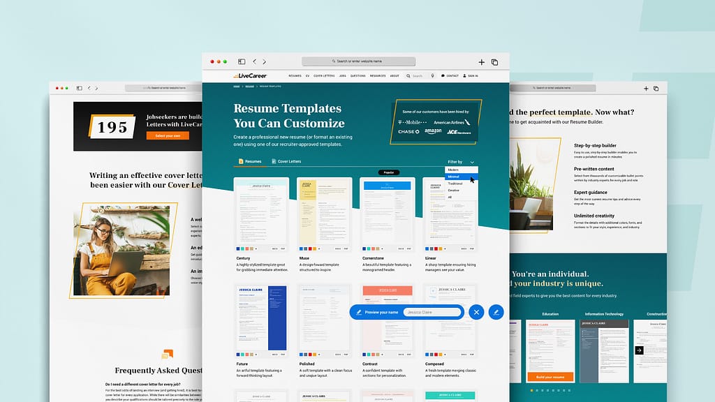
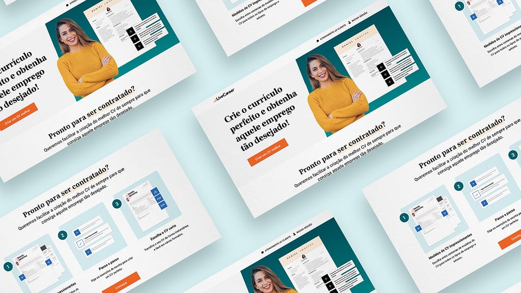
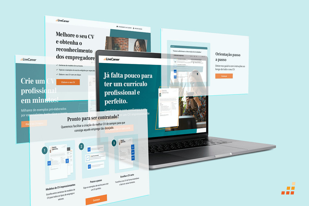
BOLD owns many brands, including Livecareer which is the original brand. I was brought to the team to help refresh Livecareer and create eye catching webpages that will result in higher click through rates and conversion rates.
Challenge
refresh and focus on bold's original brand: livecareer
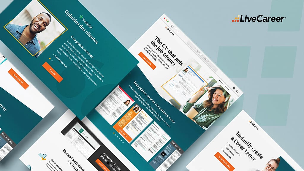
How to raise the bar on brand experience across all product and service expansions. Enhance visual design quality overall, improve content/copy, storytelling to strengthen perception, and engagement opportunities.
Process
Solving design challenges in innovative ways
- Projects begin with a kickoff for project problem/ hypothesis definition/ concept, where scope will be determined, data shared and discussed, strategy and deliverables identified and a timeline established.
- Brand Creative works across multiple areas of the business with the following teams: Marketing (ie: landing pages, email), Product (ie: builder, retention), E-comm, Content, Research.
- With the UX team, we also collaborate on Ui elements across the product areas that they work. Designers from the team are assigned specific brands/ products so they can be integrated into Ux team projects.
- Collaboration is key with teams across the organization, with defined responsibilities and roles of each person.
Branding
step 1
My first step was to expand and refresh the brand. I focused on the logo, specifically the slanted squares of the icon and based my ideas on this angled shape.
step 2
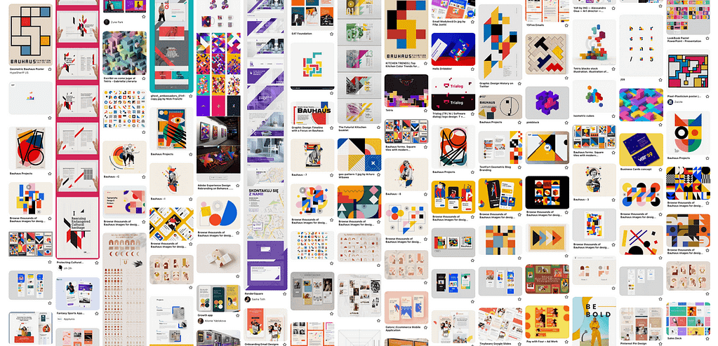
Then I created a mood board of inspirational images that contained geometrical shapes and angled edges.
step 3
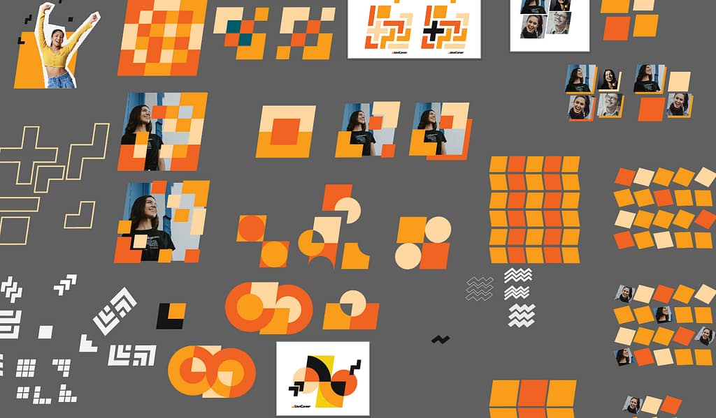
I took the inspirations from the mood board and created my own board based on the Livecareer brand. I explored many possibilities until all the pieces began to give the brand it’s own unique personality.
Hero Animation A
PROBLEM
How to showcase multiple templates and make the product visually attractive to the user.

SOLUTION
Highlight the resume template with the slanted shape and display more than one resume template within the animation loop.
Hero Animation B
PROBLEM
How to showcase multiple template + person combinations while staying on brand and making the product visually attractive to the user.

SOLUTION
With the help of the creative team, we found a way to switch the slanted shapes with the template + person combination by cropping the person within the shape and keeping the template over the shape to highlight the product.
Solution
find opportunities to implement branding
After many exercises and explorations, we updated the pre existing UI Kit and Design System with the latest brand refresh. Now, Livecareer has an original look and distinctive branding that will set it apart from its competitors.
